Design5 min readJuly 31, 2026
Designing for Strangers: The UX of a Machine That Serves Everyone
A walk-up kiosk must work for a 70-year-old first-time user and a regular who taps through in eight seconds. Here is how that tension got resolved.
Sophie Tan
BeanBotix Design
Most interfaces get to assume something about their user. A phone app assumes you chose to install it. A car dashboard assumes you sat through a handover. A public coffee machine assumes nothing at all: the next person to touch it might be using it for the tenth time today or the first time ever.
Our first display tried to serve both with a single layout, and it served neither. Regulars found it slow because everything was two taps deep. First-timers found it intimidating because everything was visible at once.
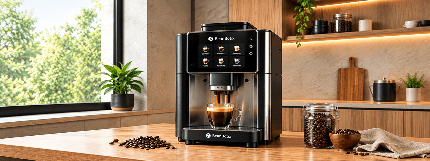
The change that fixed it was making the interface remember. A tap of a loyalty card or a phone loads a personal layout: three previous orders, large, immediate. No card means the default layout, which is deliberately slower and more explanatory, with drink photographs rather than names alone.
The second change was removing choice from the default path. A first-time user does not want to specify bean origin, milk type and cup size before they get coffee. They want a cappuccino. Customisation moved behind a single 'adjust' control, present but never in the way.
Measured across walk-up deployments, median time-to-order fell from 41 seconds to 19, and abandonment at the menu screen fell by two thirds. Neither number came from making the screen prettier.
- Design
- UX
- Accessibility
Published July 31, 2026